CATEGORY REVIEW: Zara Toys
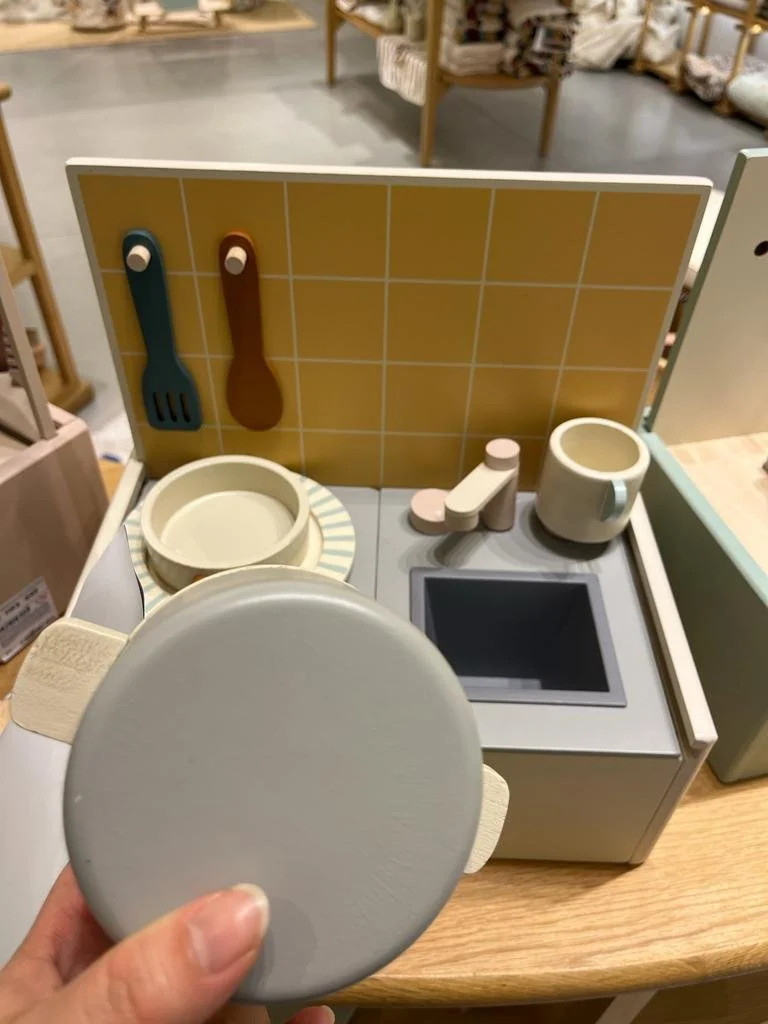
I'm not really sure when exactly Zara started seriously developing their toy collection, all I can remember is going shopping one day, and going to the second floor of their Queen's Road flagship store in Hong Kong to browse the home section. Nested between the linen and homewares sections I stumbled upon a nice area that had been beautifully set up. It was part of the Zara Home Kids range, but instead of finding the usual meal sets, linens, and bath sets, I came across several wooden toys is soft pastels and muted colors, almost Scandinavian in style. The wooden toys seemed to be inspired by Kids Concept, and the soft toys reminded me of Liewood and Little Dutch. Zara's toy collection is overall quite on trend and certainly aligned with other niche brands such as Konges Slojd, Fabelab, and Maileg. Overall a beautiful and adorable range.
That being said, there is still some room for improvement. For starters, I believe this range was conceived and developped by their in-house fashion team rather than someone actually familiar with the toy industry. Some clues to this is the product labeling (legal and technical), and packaging. This is not to say, that it is not a well thought-out range, but rather than some adjustments need to be made.
In fact, I find this range quite fascinating, because as some of you know very well, I too was the category manager for toys for a kids fashion group, so I understand the challenges associated with developing product outside of a company's initial product scope.
Let's start then this analysis by highlighting all of the strong points of this range:
Style and range coherence: This is a highly curated range, that intentionally alludes to higher end brands with its mix of soft pastel and neutral colours and clean lines. The toys are Montessori inspired, focusing often on role-play, musical, and educational toys. For SS2023, costumes or fancy dress were added to the range to further inspire creative play, as well as beach play and water toys. These are, however, not your average plastic summer toys. Silicone seems to be the material chosen by Zara, with seemingly Liewood being the inspiration behind these SKUs, albeit a bit simpler in design. The costumes, on the other hand, are a bit of a hybrid with strong hints at Souza!, Nobodynoz, and Meri Meri, two of my favorite brands.
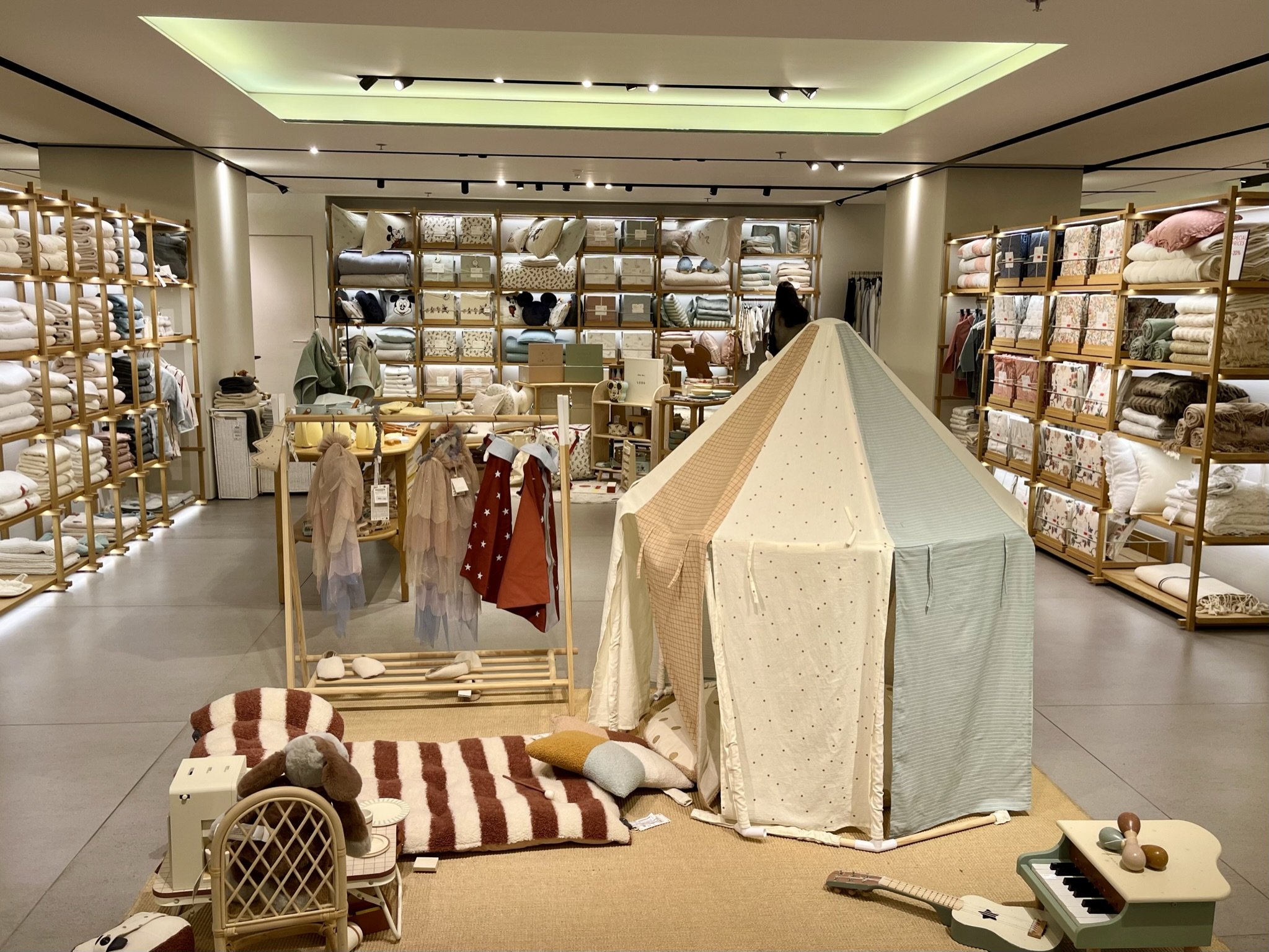


Gender-neutral range: Generally speaking, soft toys are as closest to a gender-neutral toy as can be, and yet, Zara did not bet big on such a range, thus choosing to focus instead on higher priced SKUs, that seem to complement their room decor lines. The retailer's toy collection seem to appeal to parents for whom the overall look of the room is possibly more important than the ludic value of they toy itself. These parents are looking for that picture perfect kids room, and so, it makes sense for the range not too be too gendered, a trend that has been consistently growing within the industry. That is not to say that the range is devoid of traditionally feminine or masculine toys. There is indeed a wooden dollhouse, a vanity set, and a tablesaw workshop, but there is also a tabletop kitchen, a market table, and a wooden laptop, alongside musical instruments. This is commercially savvy, as it aims to appeal to a wider audience, however, it is also commercially risky in an industry where "girl" and "boy" toys hold sway in terms of buying preference.
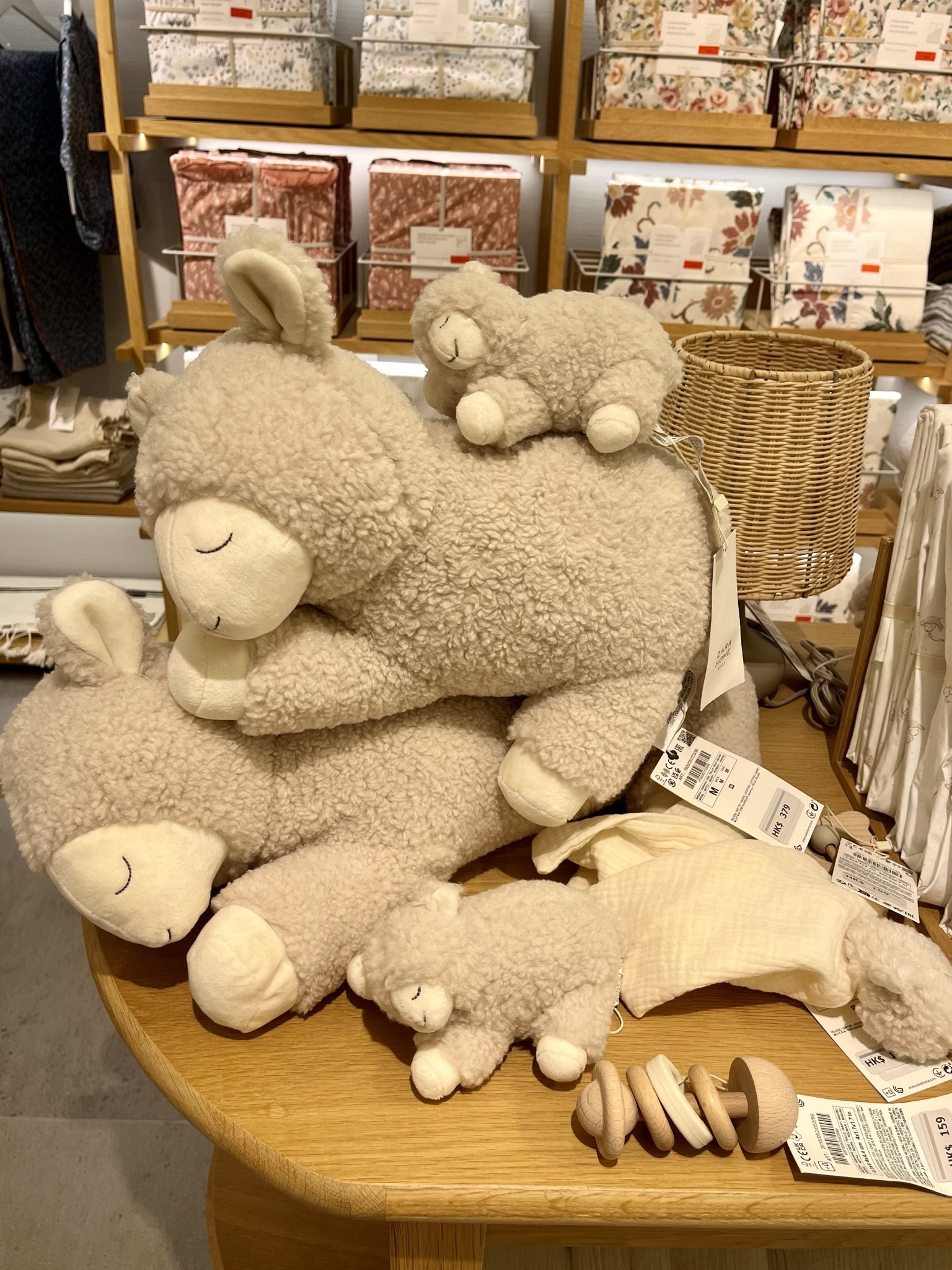
The baby range: A couple of seasons ago, Zara introduced some wooden stacking and sorting toys for those of early age; however, this season they introduced soft goods into the mix. This is a range that more often than not worked well for me, particularly if assorted to the textile collection. They're great as newborn gifts, and relatively essential for most parents. Within the range there are some pluhies, an activity cube, a baby book (always a winner!), a comfort blanket, a mobile, a playmat, and a wooden rattle. There seems to be an emphasis on using natural fibers, especially cotton gauze. Having designed countless baby toys, however, I do think this range falls rather flat. Stylistically speaking, the product matches the baby duvet cover, this range is after all being sold in Zara Home and is thus part of a home goods collection; nevertheless, the toys lack in colour and fun. They are there as decoration, rather than to educate and entertain. That is not to say that they're not functional, they are just simply a bit sad.
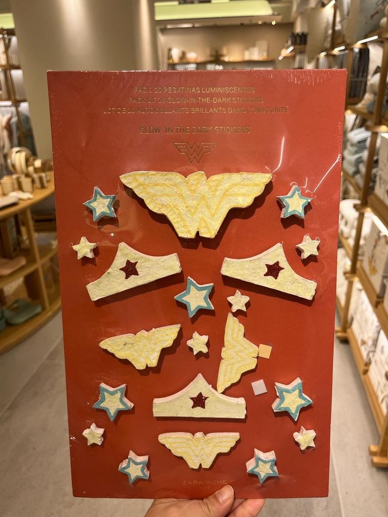
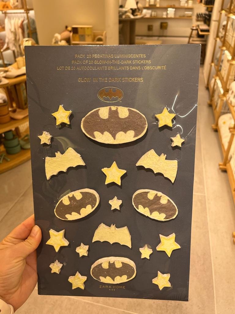
Licenses: Whilst 95% of the toys range is composed of Zara's own label, they do have some licenses. Nevertheless, the branded lines seemed to have either been intentionally given a vintage look, or colours have been muted to match the rest of the range. Finally, some storage SKUs and bedroom decor round up the range. So far, I've only seen DC Comics, Sesame Street, and Disney licenses in-store but I'm sure there's more IPs with which they could partner up ! I'm thinking Peter Rabbit (as British as it may be), Winnie the Pooh, Dumbo…
Packaging: Zara chose a minimalist packaging in kraft paper boxes and white ink printing, once again reminiscent of Liewood. I couldn't find out whether the packaging was FSC, but it would make sense if they did, especially as their hangtags do brandish the FSC logo. Packaging is minimal in an effort to reduce single-use plastic, which means no acetate windows, and paper roundels, which is commendable, and facilitates recycling. I do wonder how this kind of packaging travels. One of the biggest challenges I had working for an apparel retailer, was the lack of familiarity with how hard goods are stored (inners/ outers). Inners of more than 1 piece were essentially nonexistent, and goods would have to be shipped in bulk, which often meant the use of a polybag to protect the toy and its primary packaging, which essentially negated the benefits of minimizing single-use plastic in packaging.
Visual merchandising: I am aware that the store I went to is a flagship, and space, as pricey as it may be in Hong Kong, was not Zara's main concern. However, the toy range was given sizeable square-footage, right smack in the middle of the shop floor. Nestled between bed linens and kitchenware, the range is fully displayed amongst kids home décor. This maximizes impact, and alerts customers of the collection. It becomes a centerpiece, rather than an afterthought. Having worked on a similar range for a kids fashion retailer, I know that this is always a challenge, and how visual merchandising, both in-store and window, is key to market any new product ranges.


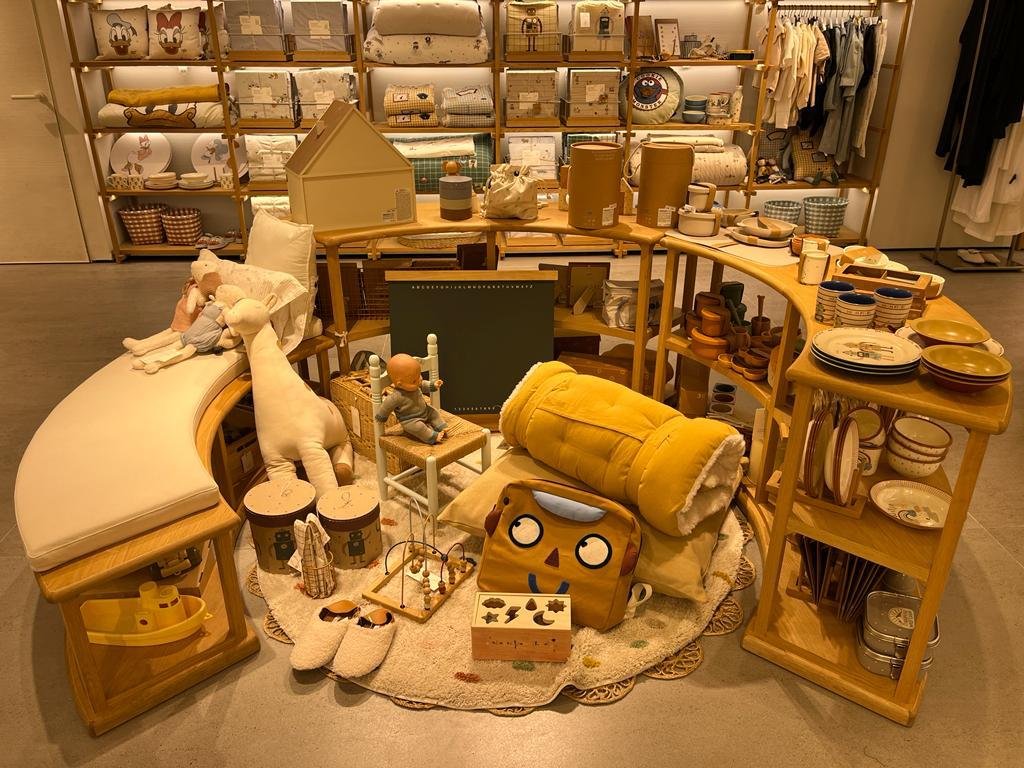


Towards the end of 2021, so a few decades ago in fast fashion years, Zara opened a new format of the Zara Home Kids store in la Coruna. With its beautiful interior design, the store clearly aims to appeal to style-conscious parents who seek to build the nursery of their dreams. The store is almost exclusively devoted to their toy range, but do also have some limited clothing lines. With almost 160sqm of floor space, there really is no limit as to how the toy range can be displayed and be fully integrated into the existing Home range. More importantly, it lets visual merchandisers build a fantasy world that lets kids and parent alike live the magic of play.
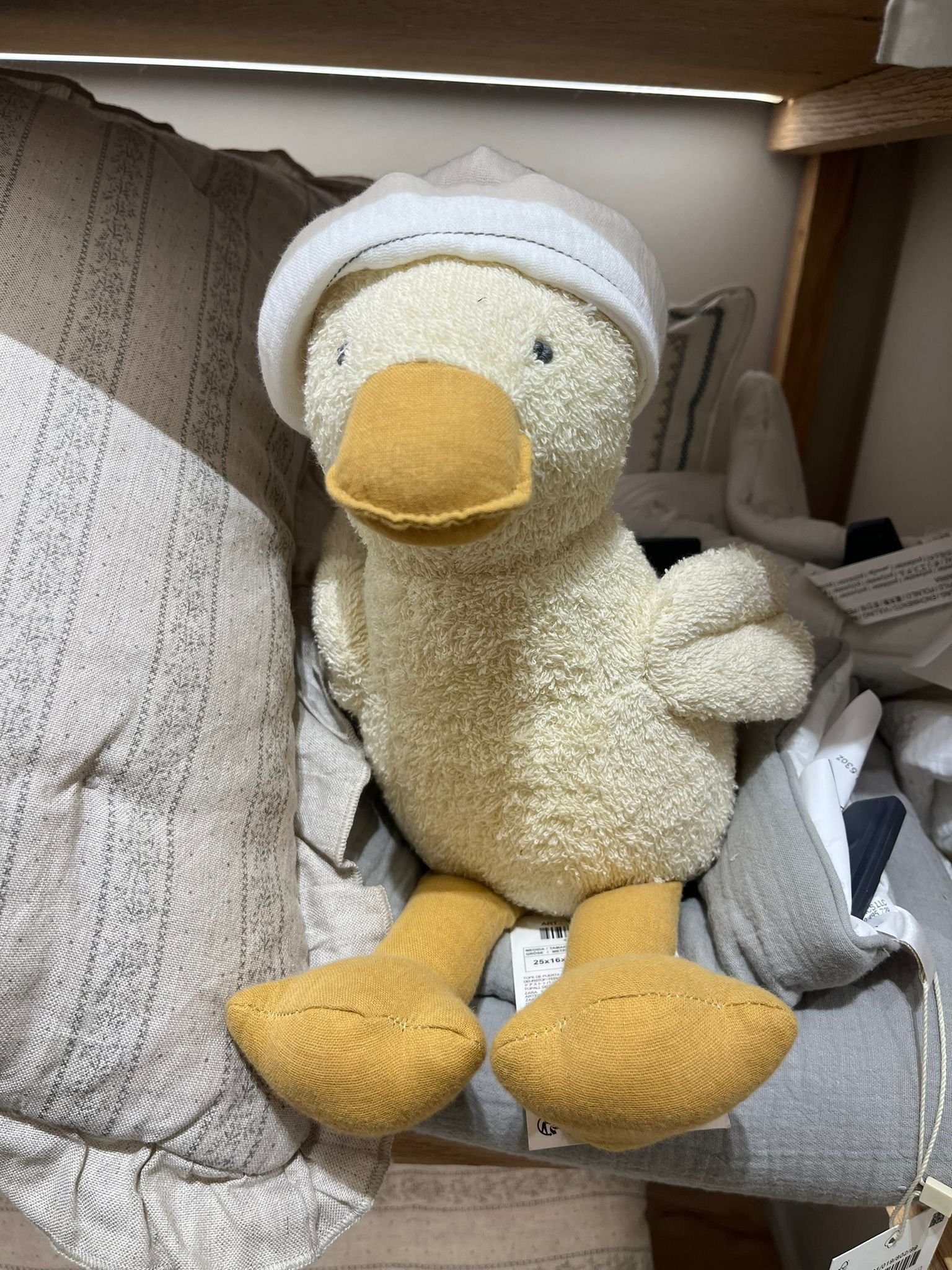
I wanted to see if the expanded Zara Home Kids universe had been adopted by other stores in different regions so I visited a Zara Home store in one of the wealthiest neighborhoods in Mexico. Other than the Disney lines, the range was almost non-existent. I did notice, nevertheless, two adorable little ducklings in terrycloth and cotton gauze that were too cute for words, as well as one of the sheep from the baby range, but the focus was really on linens, storage, feedig, and home décor lines.
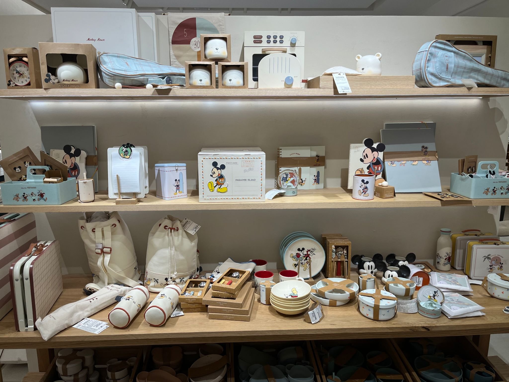


Having reviewed the strong points of the Zara Toy range, I would like to highlight a key area where I think there could be some improvement: labeling. This is something that apparel retailers seem to struggle with when going into the toy category. They keep using the same apparel labeling format on both packaging and SIL, which often goes against the EU toy directive. Oftentimes, products that would be classified as toys by any third party laboratory, are mislabeled as fashion accessories, thus risking a product recall. An example of this is bunny-shaped bags and backpacks. As functional as they are, children will mistake them for a toy, and a 0+ toy at that, which makes these products particularly susceptible to being recalled. A choking hazard warning is not enough to comply with EU directives.
This is even more true for the baby range, which might have been more carefully constructed, but does not have the right SIL. Batch codes, care instructions, CE/ UKCA mark, and product reference are all missing.
ETA: Whilst in Mexico, I noticed batch codes, and correct QA markings were on the SIL. I’m not really sure when these were added, or if they were already there from the get-go and I just missed them, either way, I’m happy those pieces of information are now there.
FINAL THOUGHTS
The apparel industry is a tough and competitive one, with diminishing margins, and increasingly more complicated supply chains. It, therefore, makes sense for retailers such as Zara to start branching out into new categories where profit can be maximized, and where direct price/value comparisons are less obvious. In the last few years, Zara has gone into cosmetics, pet toys, and kids beauty. Some lines have been more successful than others, but I'm really looking forward to what they do with their toys range, and to see whether it will succeed on its own, or fizzle out as the former toy range I worked on did.


